Home Technology Software Bixby Got A New Update With A ...
Software

CIO Bulletin
28 October, 2020
While Samsung has been criticized for its below-par product “Bixby,” it has still not given up on its own assistant. In the past, Samsung has been criticized for including a physical Bixby button, which was of very little use as most of the users' preferred Google Assistant over Bixby, and further, the toggle wasn’t even configurable.
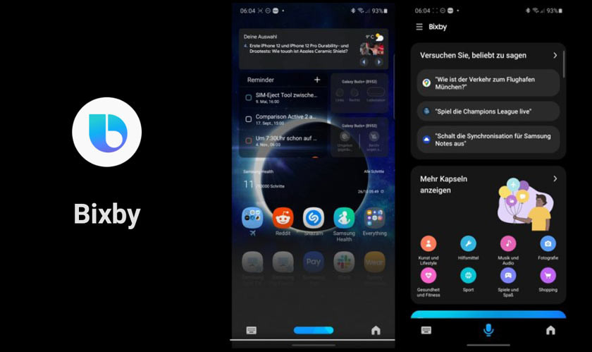
But after a long time, Samsung has updated Bixby and slowly rolled out a more refined and faster Bixby to Samsung smartphone users. The design overhaul brings in an updated icon and a complete visual refresh. The new Bixby looks modern now with a sleek interface, much like a cross between Google Assistant and Siri’s interface.
The first look of the same was shared on Reddit by a user named MehdiMa0507. The new Bixby interface is minimal and takes up very little space, unlike earlier, where it used to engage an entire page. The Bixby UI now only appears in a small section at the bottom of the page with a faded background like the Google Assistant. The old Bixby icon has also been replaced with a flatter alternative that switches to a horizontal bar when the voice assistant is listening for your command.
The Bixby page has also been updated with a bottom navigation bar that now has three icons - a keyboard icon to issue text-based commands, a microphone icon to issue voice commands, and a new home icon. The color scheme for the page has also been updated from different blue shades to black/gray. The updated Bixby interface is currently rolling out to users running both One UI 2.1 and One UI 2.5. However, the update is not available for all the users yet, as it is rolling out in a phased manner.


